After a short hiatus for which I blame DX:HR.. I returned to do a new YT layout, a new logo to go with it and a revision on the UI I had been working on.
Completely out of my comfort zone I was forced to do the layout and logo strictly in Photoshop. Which essentially meant that I was working with shackled hands while blindfolded. After some frustrating first attempts and not getting anything working the way I wanted to I had to get mentored just to get under way. Once everything was sort of working I whiped up a extravagant version of the logo. Then I ended up peeling back some of the extra stuff I had done to it, only to settle on the most minimalistic version.
V.1
V.2
Final
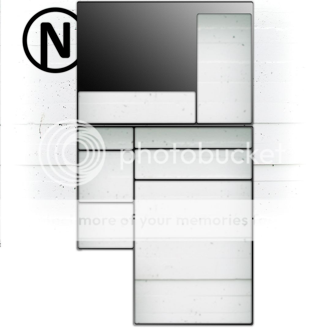
Minimalism seems to be a reoccurring thing for me as I shall come back on in the final part. However, after finally being somewhat satisfied with the logo I went to work on the YT page. It honestly isn't my cup of tea but it had to be done at some point. Resorting to standard colors/layouts or possible wallpapers was out of the question. Instead I went for a relatively clean look, sticking with the carbon fiber that I had worked into the initial iterations of the logo.
The layout is pretty straight forward but with me being as clumsy as can be with PS it took a little longer then I would've liked. However after fixing some things up and settling on the elements it turned out decently enough and I'm fairly pleased with the end result which can be found here on my youtube page.
Finally I did made a revision of the UI [keyboard] I was working on. I've decided to step away from the particle system I was using for the UI earlier as it's simply too unwieldy to implement in correspondence with the map. The added particle system for the keyboard would drastically increase render time and in the end be less flexible. So I've made a quick mock-up/revision of a new simpler setup that I'll be using which will consist of a collapsed set of solids rather then a particle grid. I'll have to displace some of the elements a little more in depth but for now it gets the point across and could technically be used as is.
As requested or rather demanded I've included a audio source to make it less dull. Hope you're happy now person putting me up to this.
While not a huge update text wise I'll share some content that I finished. I'm still debating on which version to use and any feedback as to what I could or should take into consideration/change would be appreciated. Right now this is what I have:
Full Keyboard
Slimmed Down Keyboard
Minimalistic with track pad
Regardless of me settling on one of these or changing them up a little tomorrow I'll direct my attention completely to the map again. I'll also be sure to get some color into this blog.
That's it for now though, I'll write a update tomorrow night.
Today I tried finishing up the map by adding geometry and rescaling some of the height levels. While I didn't get to finishing all of it I'm very close. While readjusting some of the levels I decided to work out the UI a little more.
I had a few idea's in my head mainly a 3D mouse kind of like an Omni tool that one would find in the ME Universe. But after spit-balling a little bit I came to the conclusion that having a mouse interface like that would be rather counter intuitive and would just net me extra work. As such the mouse & keyboard combination was scrapped and I settled on a menu & keyboard.
Having a holographic keyboard that will be typed on presents a few problems. The actor needs a reference of where in the air to type and in post production you need solid tracker points. With that in mind I came up with a small wire rig and 4 bright reflective beads. The idea is that 2 wires suspend 2 beads each with every bead representing a corner of the keyboard. The wires will be suspended outside of the shot and the wires themselves will be easy to clean out later. This will give both the actor and the tracker the same solid reference and should hopefully make for a good set of shots.
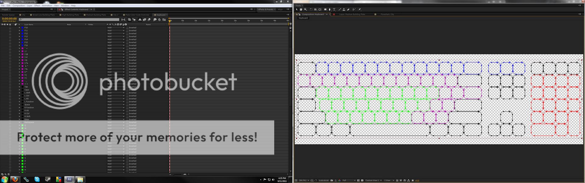
I'm aware that typing in the air is an issue so I'll have to make sure that the person who will be doing so will at least roughly adhere to the qwerty layout when typing. The reason I want to get that down as solid as possible is because I want the keystrokes to light up. It would essentially be visual instead of force feedback that you'd get with normal keystrokes. This brings forth something else as well though, it means that I'd have to create a keyboard that adheres to the qwerty layout and have each key work and function accordingly and independently. To do that I made a full keyboard with each key labeled and marked with their proper function.
As you can see in the image above each key is color labeled according to it's group and named after the specific function. Having the script and footage at hand it'll merely be a matter of syncing up the keystrokes to the actors performance.
The keyboard itself is a depth map as well and will work in a similar fashion as the map is set up as well. Which means all the visible lines will generate and displace a set of particles. I realize that it looks rather bland at this point without any characters on the keys. Reason being that I'm still debating if characters would make it too chaotic with the particle grid. That will simply just be something for tomorrow when I give make a test animation.
The menu/monitor I have in mind isn't going to be overly complex and should become rather straight forward as well. I'm planning on keeping it very minimalistic and efficient with it's purpose in shorts scenario in mind. The actual design is still up in the air at this point but we'll fix that tomorrow.
Due to a few private matters over the past week or so I've barely been able to put myself to much work. It's not so much that I can't I just haven't been feeling up to it. I however feel obligated to at least keep up to date on some things.
As instigated by someone else I started a quick typography video. Nothing groundbreaking or special just simply something to loosen myself up a little bit. After going over a few audio pieces to work with I had settled on something. However I found myself pushing for a visual style that I was unfamiliar with. Now I'm all for breaking new ground but because of that I didn't get anywhere near where I wanted to be. The idea was to generate and disperse lines from the audio in smoke and have the air push out and disperse them. The problem that you however end up running into is that with all the particle and grid systems you end up with a mush of hard to control particles. Control aside however, I find it impossible to generate a nice looking volumetric puff of smoke that reacts how I want it to.
While running pre-renders for a 51.840.000 [9600x5400] particle dispersion comp I briefly looked into what other methods could possible work online. While browsing around I quickly came to the conclusion that the systems I though of using simply weren't up to stuff. And that if I want to pursue those type of particle simulations I really need to move into the FumeFX space. Which will definitely be something on my list as a lot of the ideas that I do have require a little more advanced computing, a system that can realize that and a render engine to go with it. I simply just need a little more wiggle room aside from AE and C4D. Expanding the tool set will a lot of fun as I'm always very enthusiastic when expanding my knowledge and with that creative freedom.
So while I don't have anything to show for today I will be working on things tomorrow. I'm hoping to potentially show you the fully populated map as well as a mock-up of a UI and maybe even some concept art.
It's been well over a week since my last update. While I haven't sat around and done nothing, the map is still not finished and some of the other elements are taking their time as well. Because I got frustrated and bored with the project I ended up starting a little side project but more on that near the bottom of this entry. Another somewhat unpleasant thing happened as well. My RAID controller and with that some of my RAID configurations is biting the dust. It has died and then miraculously reanimated itself on multiple occasions now, which all in all has made me very wary of the integrity and safety of the data on my R-0 configuration. Now is not the time to complain about that though.
Same as last time I've added more geometry to the maps and have tweaked the particle look and behavior slightly. A couple of the biggest changes however are the viewing distances, geometric clarity and fixing the world axis. Over the course of generating the city I had not realized that I had in fact flipped North and South around while keeping East and West intact. This had made it somewhat hard to gauge the height levels of the buildings, this sadly is still an issue and I'll more then likely have to re-tinker the height levels once more.
I have yet to venture back into tracking the comp but this is something that will come about in a few days. Jeroen Wolf suggested that I should try The Foundry's Cameratracker AE plugin instead of doing the tracking externally. Having used a trail version of the plugin when it first came out I can't say I'm too optimistic. I will however give the newer version a go whenever I do shoot new proper shots.
I have touched on how I'm generating the map prior but I felt like I should elaborate on it a little. As stated before the maps are generated using 3 separate particle grids, each with their own density and resolution. All 3 of these maps are then displaced separately with their own depth map to accommodate the wide range of height and complexity in the geometry.
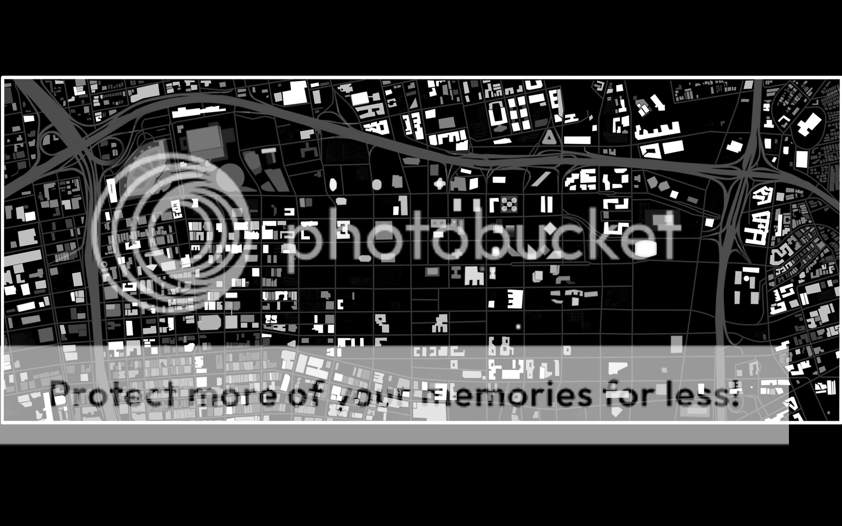
The depth maps themselves are alpha maps, something similar to what you would use as a track matte. Essentially white equals opacity and black equals transparency. In layman terms this means that what ever is white becomes viewable and what ever is black becomes see through or invisible. On the left here you see the complete current map with all the height levels mixed through each other.
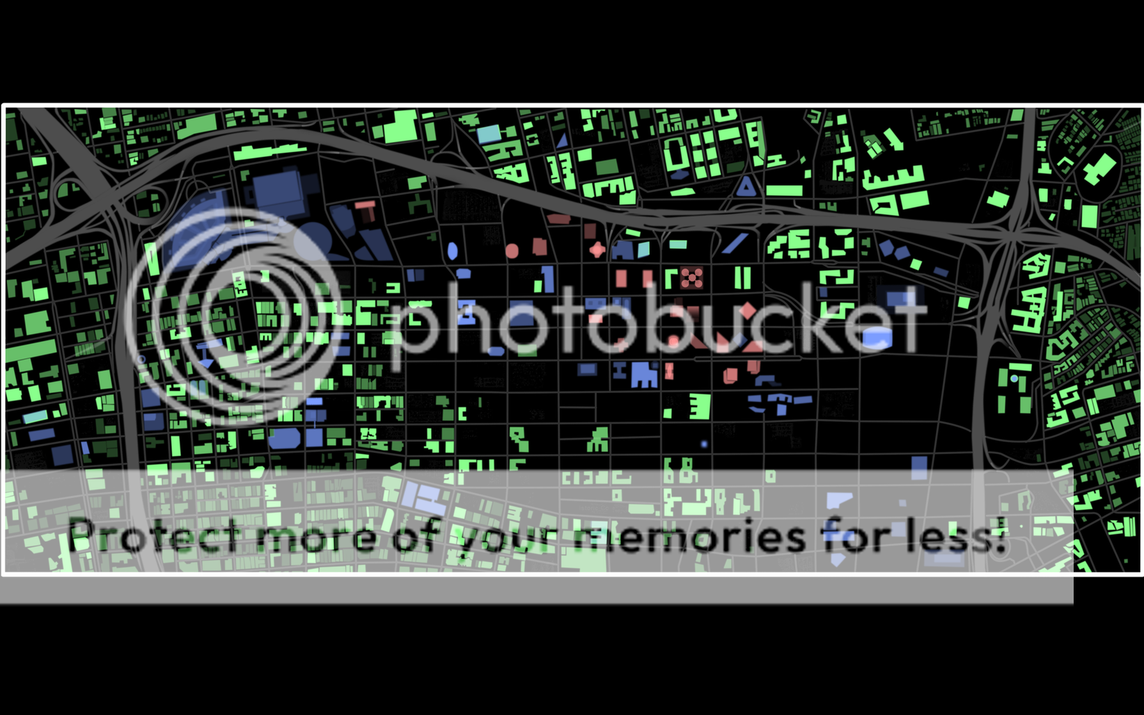
Using that map would however be tedious and unpractical unless I were to sacrifice a lot of detail. As the range from the lowest to the highest building as well as things like streets would depend on a single white to black range. Instead I split the range into three levels. Each with their own level of displacement. Making something that is a 100% opacity on the green level only 40% on the blue one. In geometrical terms these maps and individual displacements amount to roughly the following representations in height displacement relative to the map.
Green - Low [~1/4 floors]
Blue - Medium [~5/20 floors]
Red - High [~15/60 floors]
At this current point I estimate the total mask count on the masks to be around 2500 in total. And as you can probably imagine, having to adjust opacity levels for each and every single one of those as well is quiet tedious. As such I started a small side project with no real goal other then for my own amusement. For a few days running I'd find myself playing and recording my game sessions for about a hour at a time. I've been getting back into Battlefield: Bad Company 2 as of late, which I'm sure has something to do with Battlefield 3 being on the horizon. It wasn't much more then recording some cool stuff and showing it off to some of my friends.
After getting immensely fed up with my holographic project I decided to just toss some of the recordings onto a Premiere timeline. After messing around for a little bit with some of the kills that I had made and listening to some music on the side I came up with the idea of doing a small mini montage. A day prior I had found the following old Halo 2 montage from mid 2005, I'm sure that was a motivator of sorts.
The new short montage however would be a lot more mature then my immature endeavors of 6 years ago. I went for a dub-step track which isn't all that original, not a single fuck was given however. I wanted to try my hand on doing very specific motion sync without relying too much on composting. Motion sync is something I've always tried to do in all my projects, but most sources need to be forced a lot to work. I decided to keep to relative basic movements for now. As for instance the sweeping of the camera and the pulling of the trigger. As of yet I have little to show for it aside from the following 7 second clip. But I think it would be nice to at least finish the 1 minute audio cut that I've made for it at this time.
Now we return to the main project at hand though. I have a few things that I have partially worked out but I'm not comfortable sharing yet. Specifically I'm talking about some of the UI elements and systems. I have a few sketches sitting here for rough concepts so that is definitely something that's being worked on as well. Along with that I'm also starting to push my normal drawing a little bit. While I've been slacking in that department I'm very much aware that I'll need to be hooking up my tablet asap again for doing for example humans/creatures and environments.
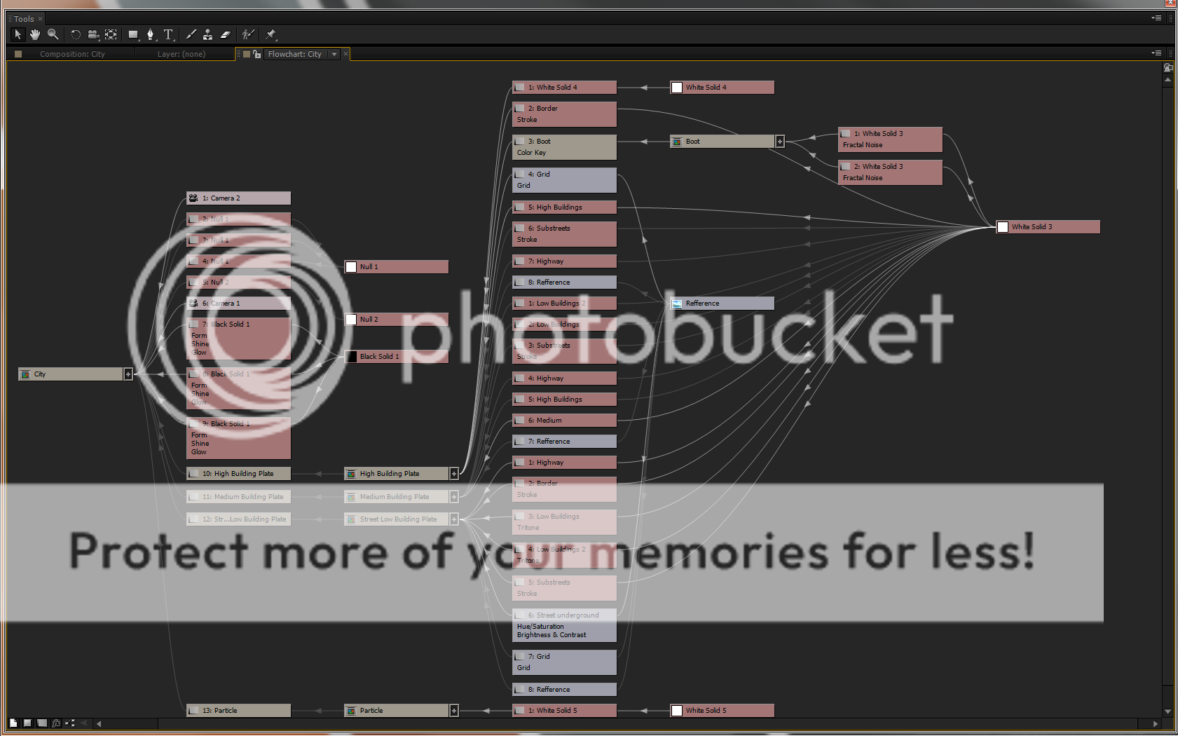
Something I am however comfortable with sharing is the following flowchart depicting how the current project is setup. On the left you see the final composition node, moving to the right you see it spread out and list what is it is comprised of and what each layer is doing. It is a relatively simple composition to setup it simply takes a lot of work in the third level of the comp, being the tedious depth maps.
As a final piece I've also rendered out a latest pass of how the city looks right now as well as a animated look at what the color coded depth map looks like. I really do hope that I'll finish populating the city before the end of the weekend as I'll more then likely be dragged away from my workstation.
I'll end up adding a lot more to these posts in the coming days/weeks. For now I'm calling it a day.


 Minimalism seems to be a reoccurring thing for me as I shall come back on in the final part. However, after finally being somewhat satisfied with the logo I went to work on the YT page. It honestly isn't my cup of tea but it had to be done at some point. Resorting to standard colors/layouts or possible wallpapers was out of the question. Instead I went for a relatively clean look, sticking with the carbon fiber that I had worked into the initial iterations of the logo.